


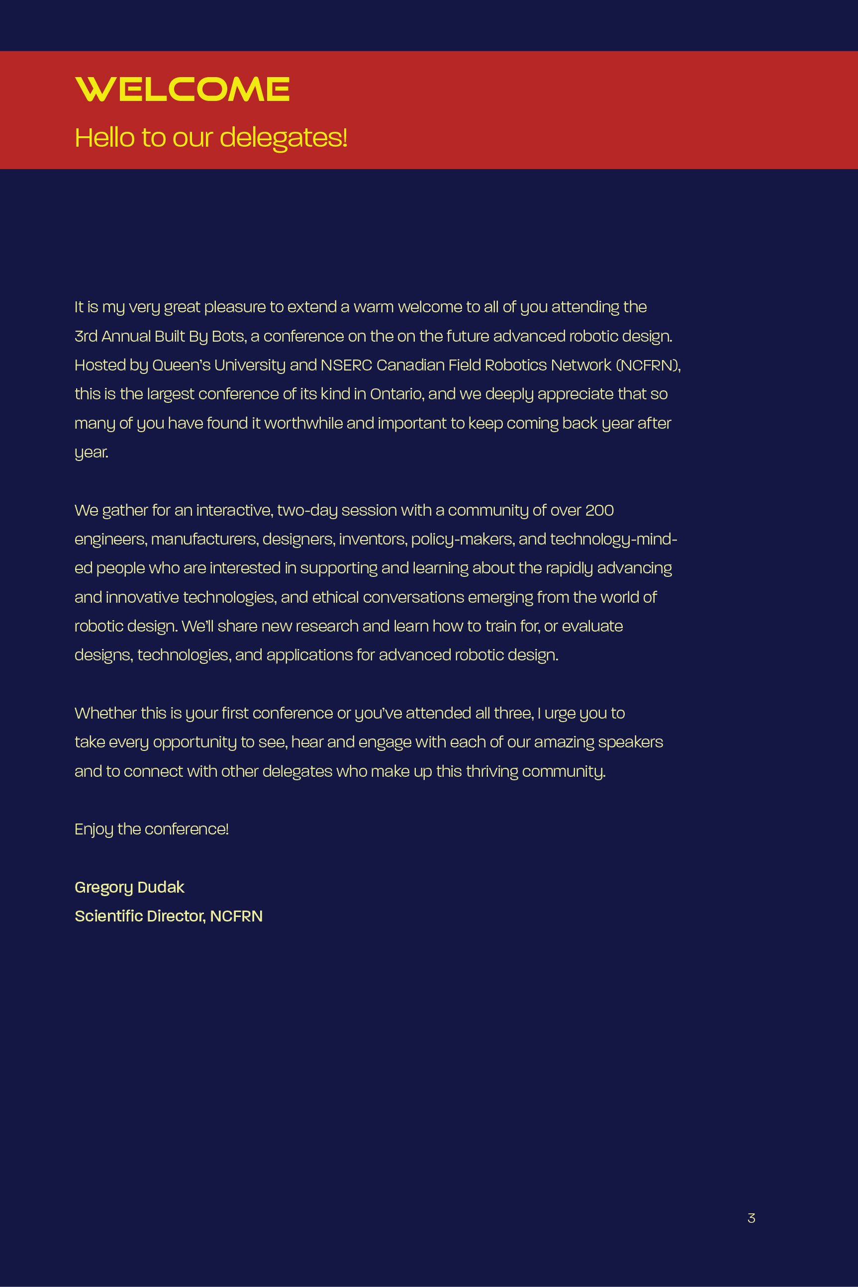
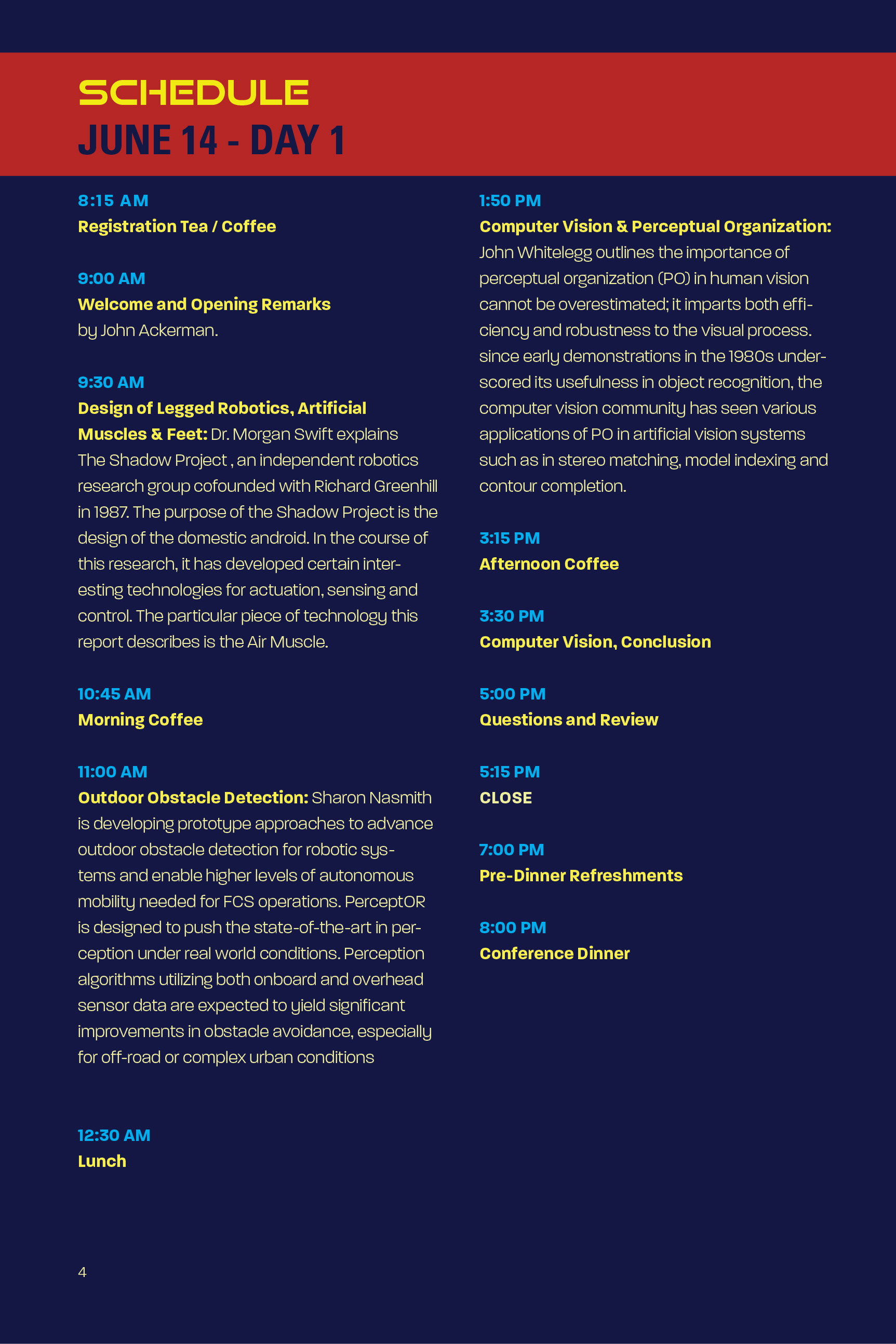
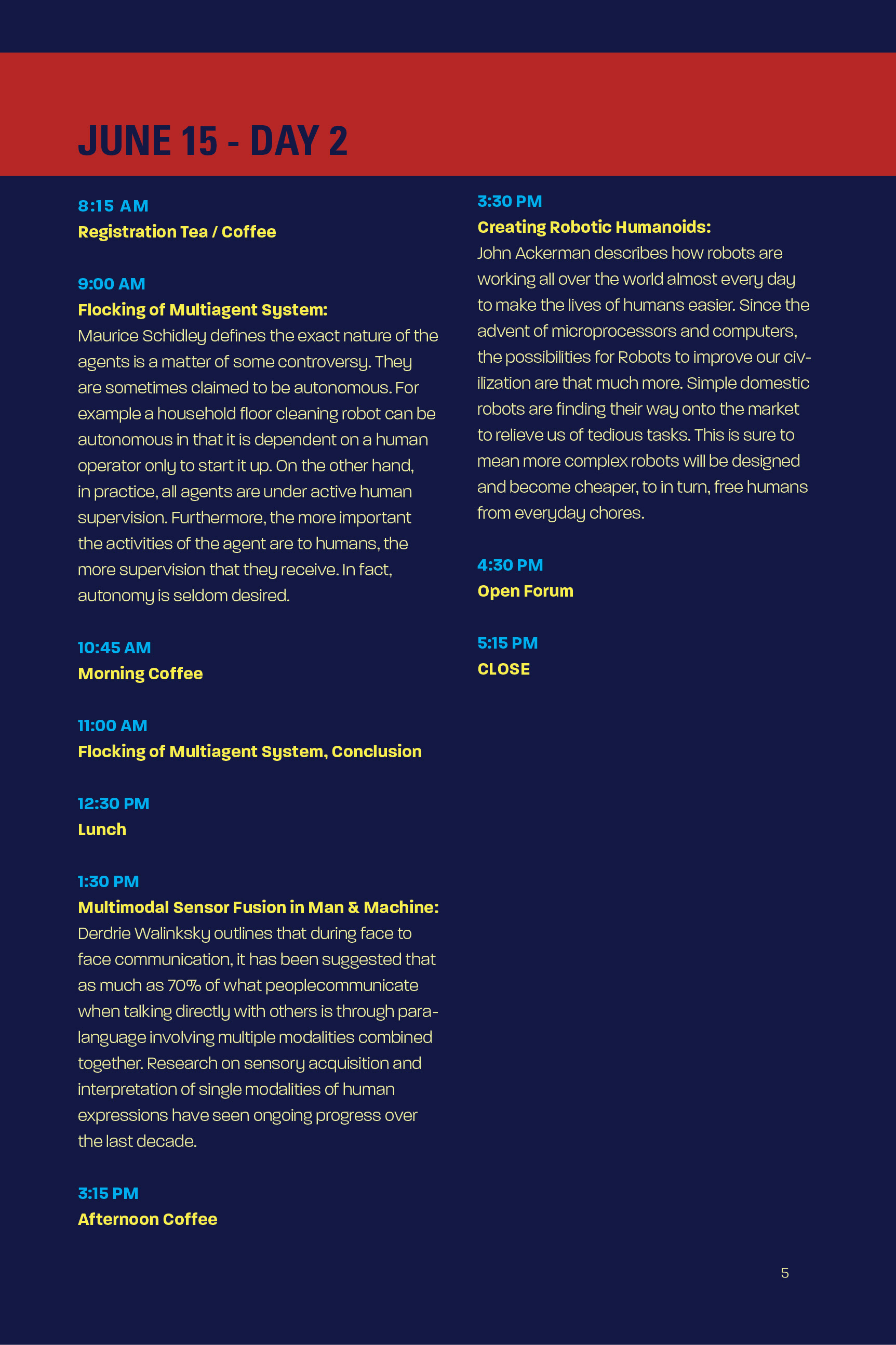
Sooooo close, yet sooooo far!
We're at Phase 3 of the Conference Project which is the Conference Booklet.
Some of the feedback I learned from today's critique are:
- Align to Here on InDesign (cmd + \)
- Putting the topic description on the Speaker pages instead of the Schedule to save space.
- Contrast issue. Background appears too strong; save the blue background for some pages instead of all of them. Notes page should be free of that blue background. It was also suggested that I could use the dark blue colour for my font colour. Another suggestion was yellow background and blue on top.
- Increase the type size. With the free space on the schedule, I would be able to use a bigger text instead of cramming all the content in there.