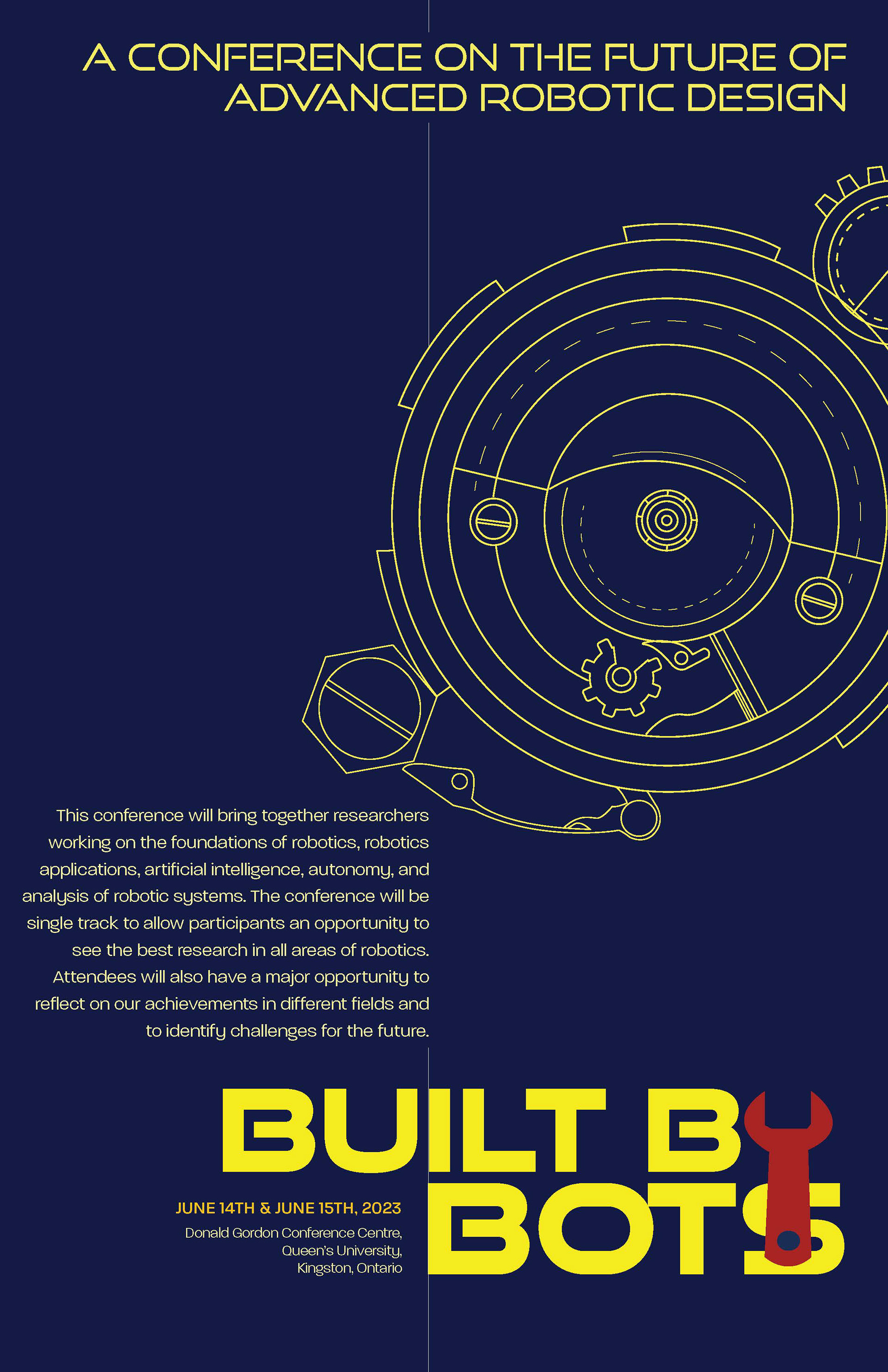
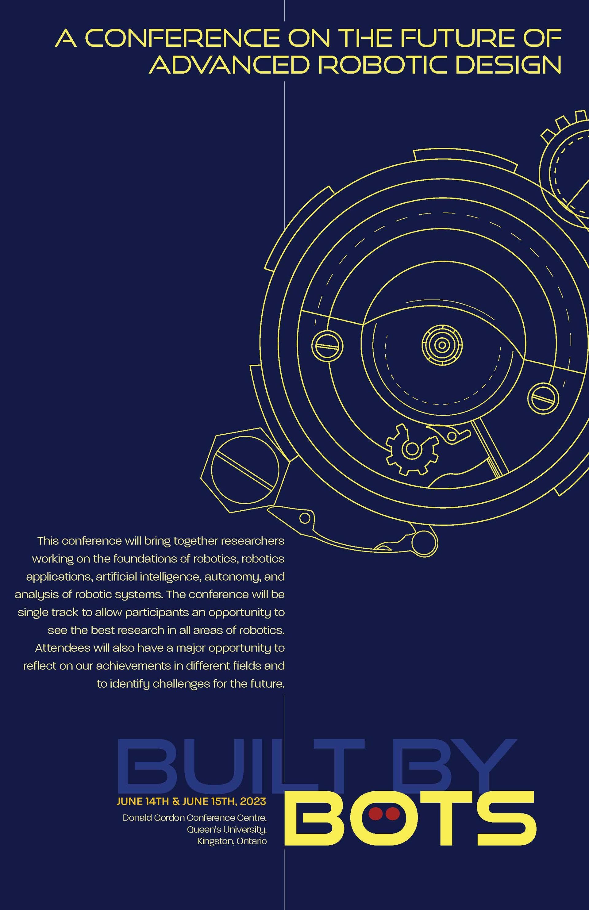
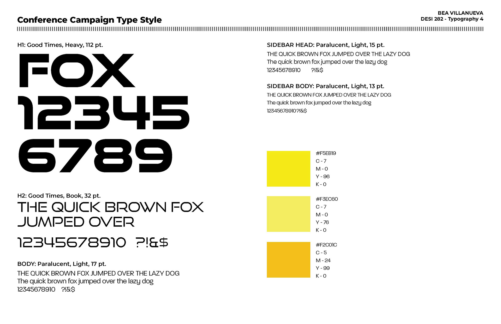
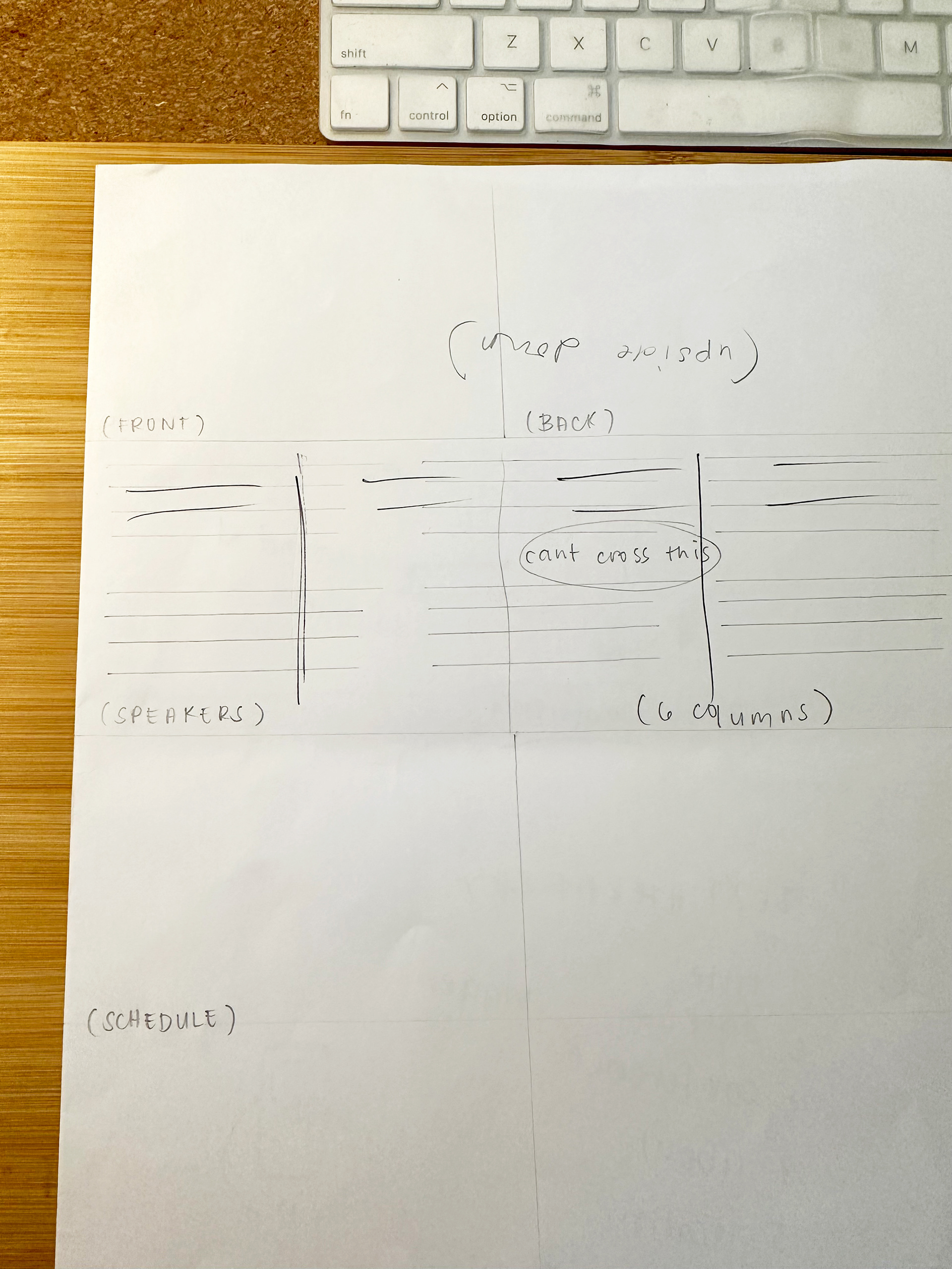
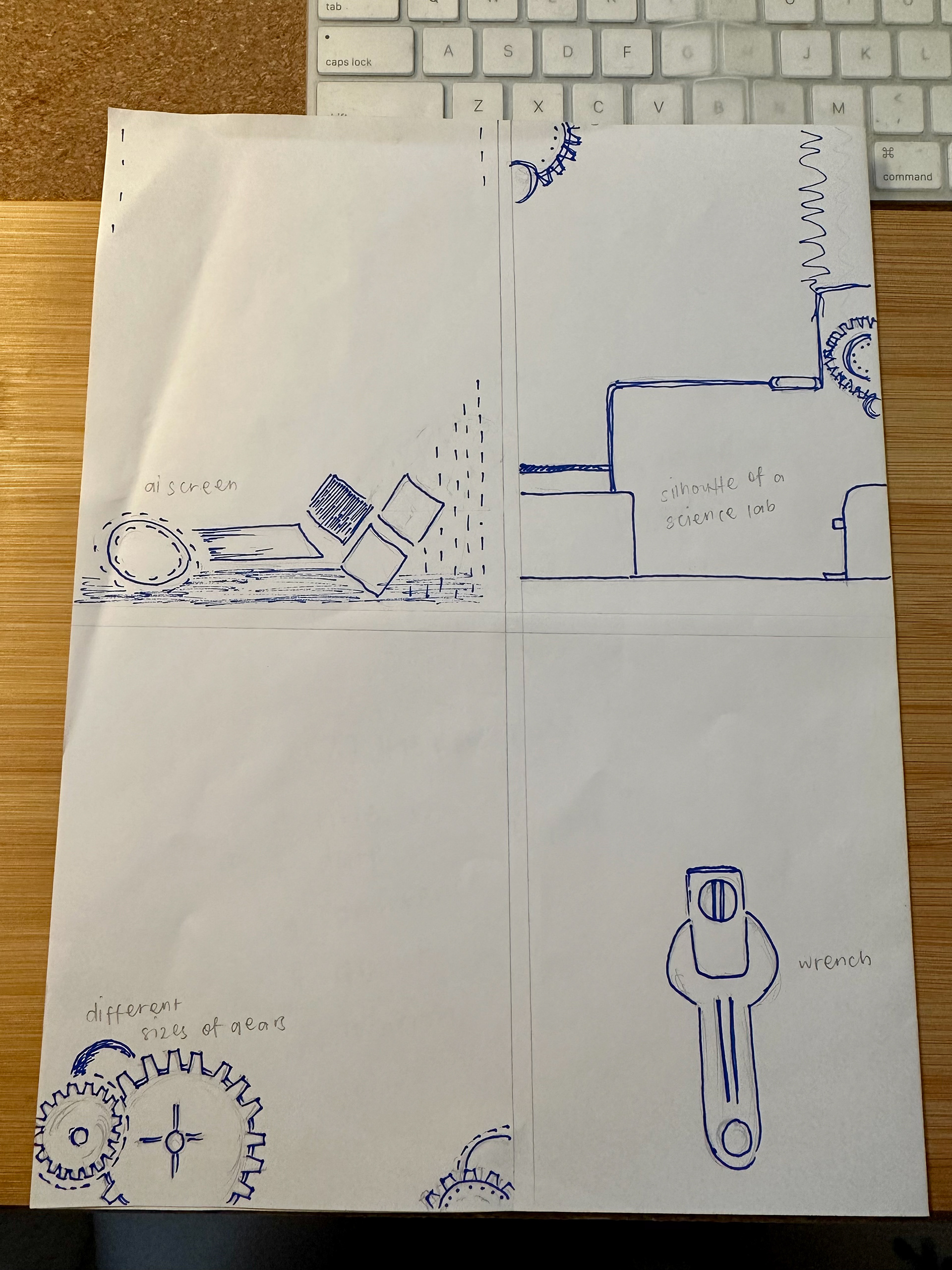
I took last week's feedback of incorporating the gear imagery and the two column grid in my poster. I was still undecided with which title cluster to go with so I brought these two posters with different title cluster for critique. My brochure layout proposal was a three column grid for the speakers and schedule, however, I learned from today's feedback that the brochure would have a fold in the centre and so three column grid wouldn't work, but what I could do instead was have a six column. The images above are 1) & 2) are refined poster layouts and 3) & 4) are brochure layout proposal.
Today's majority votes goes to the title cluster with the wrench. More feedback I got for the poster was to bring down the conference headline a bit as it was too close to the top, and instead of right-aligned type, try left-aligned. For the body copy, find a way to put it in the empty space near where the gear is (to it's left). Additionally, to make the title bigger.
So that's what I will do.