
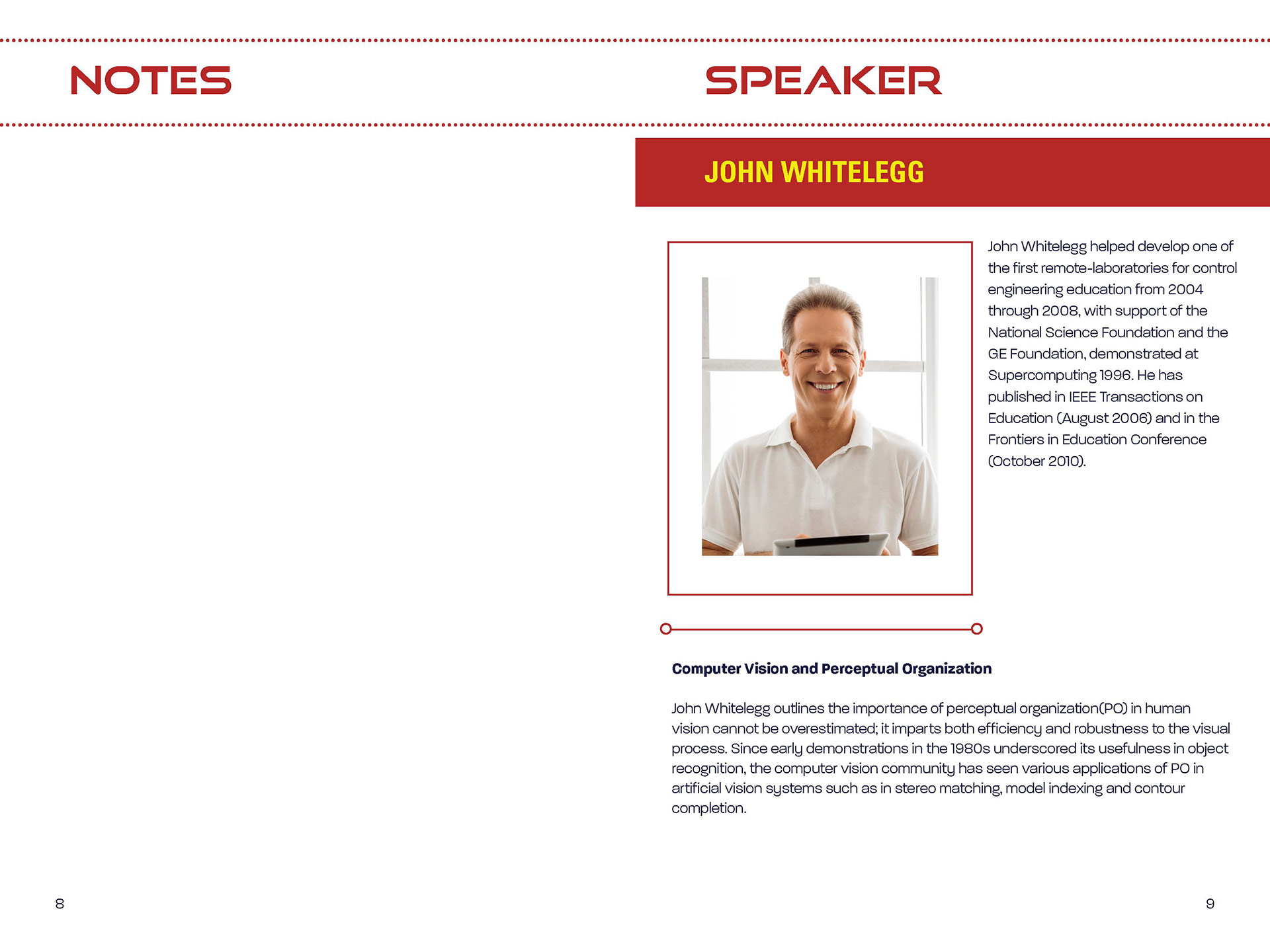
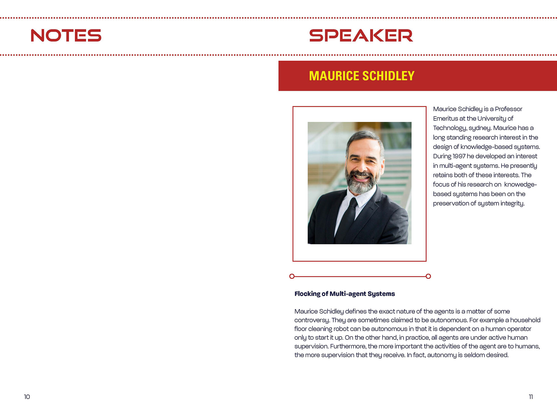
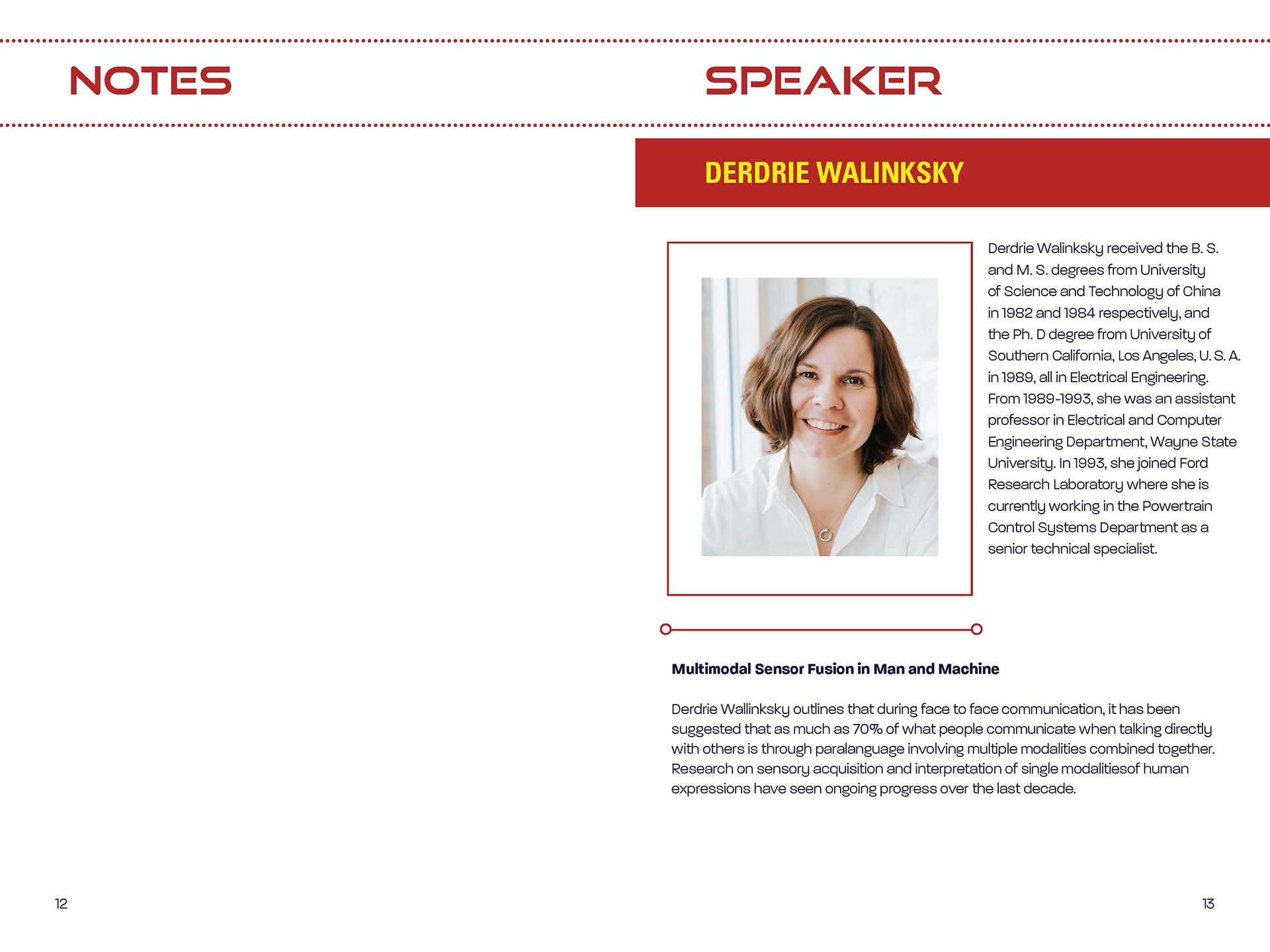
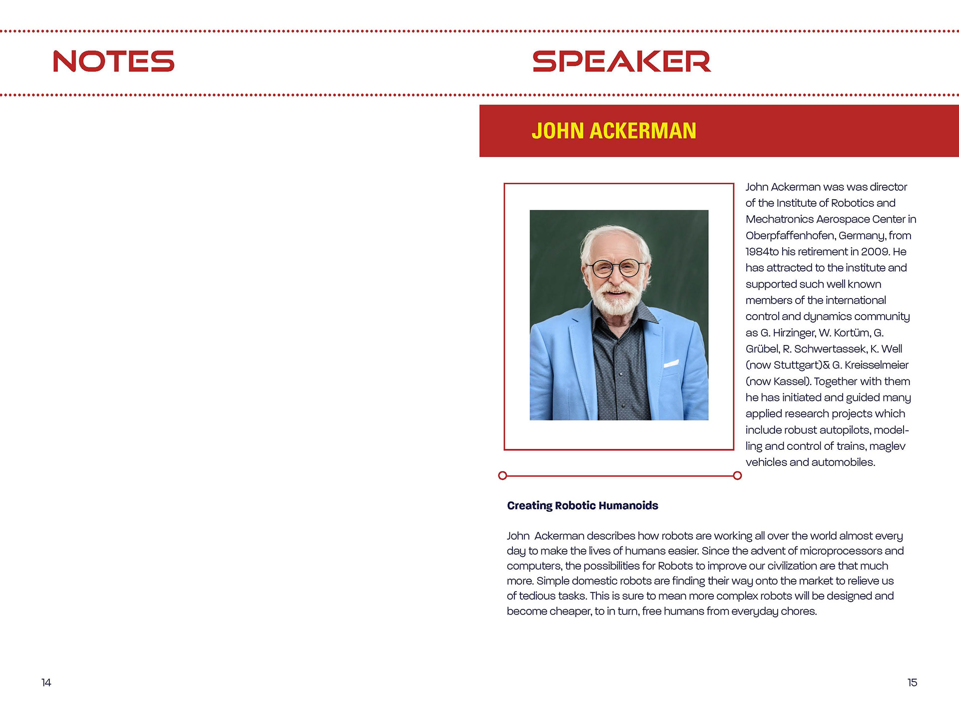
We're getting there! Woohoo!
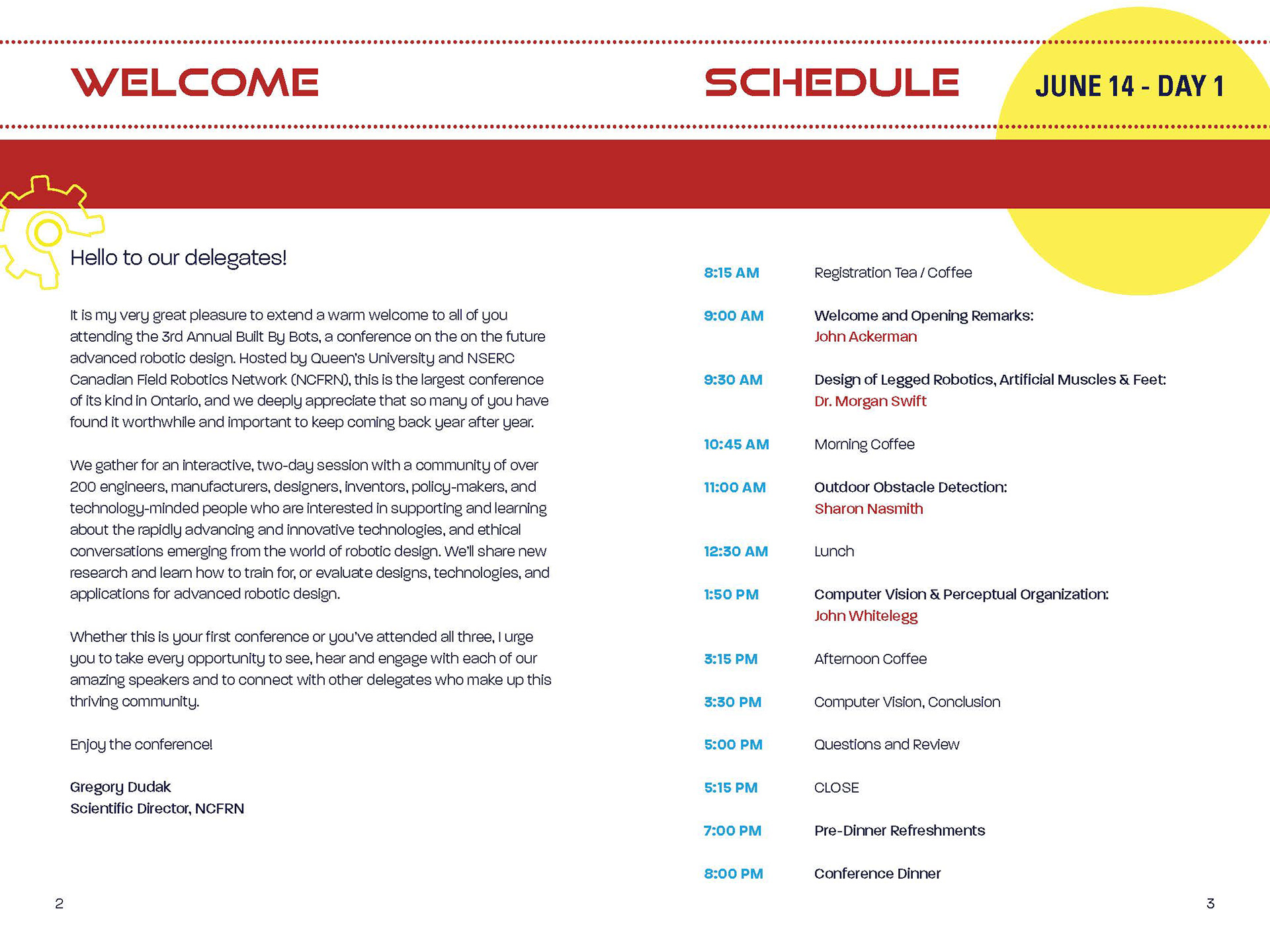
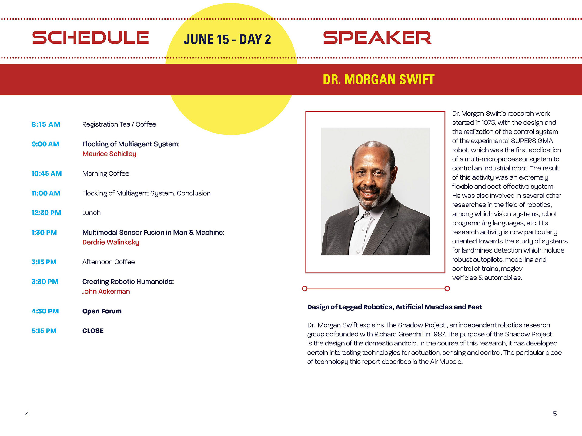
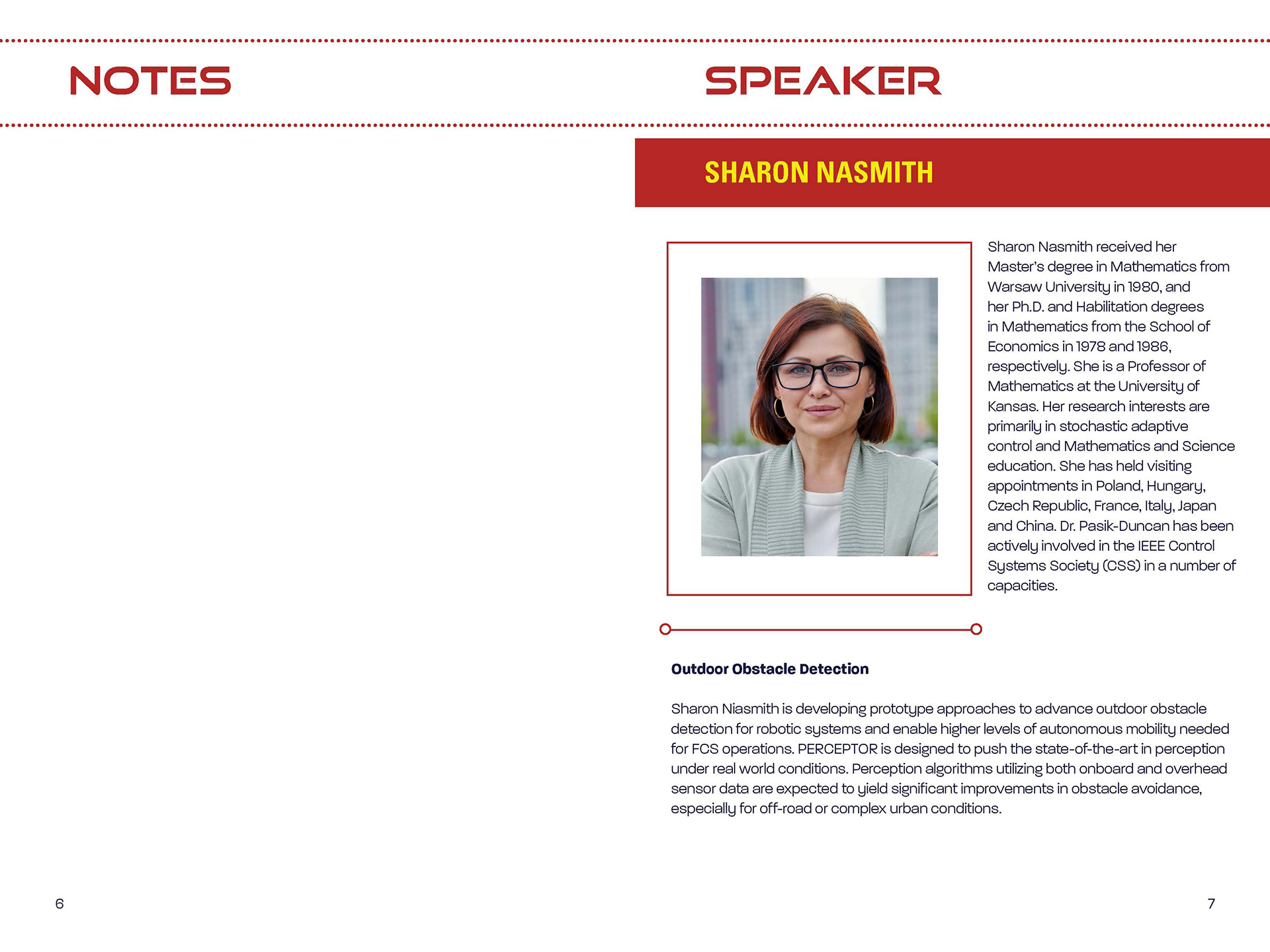
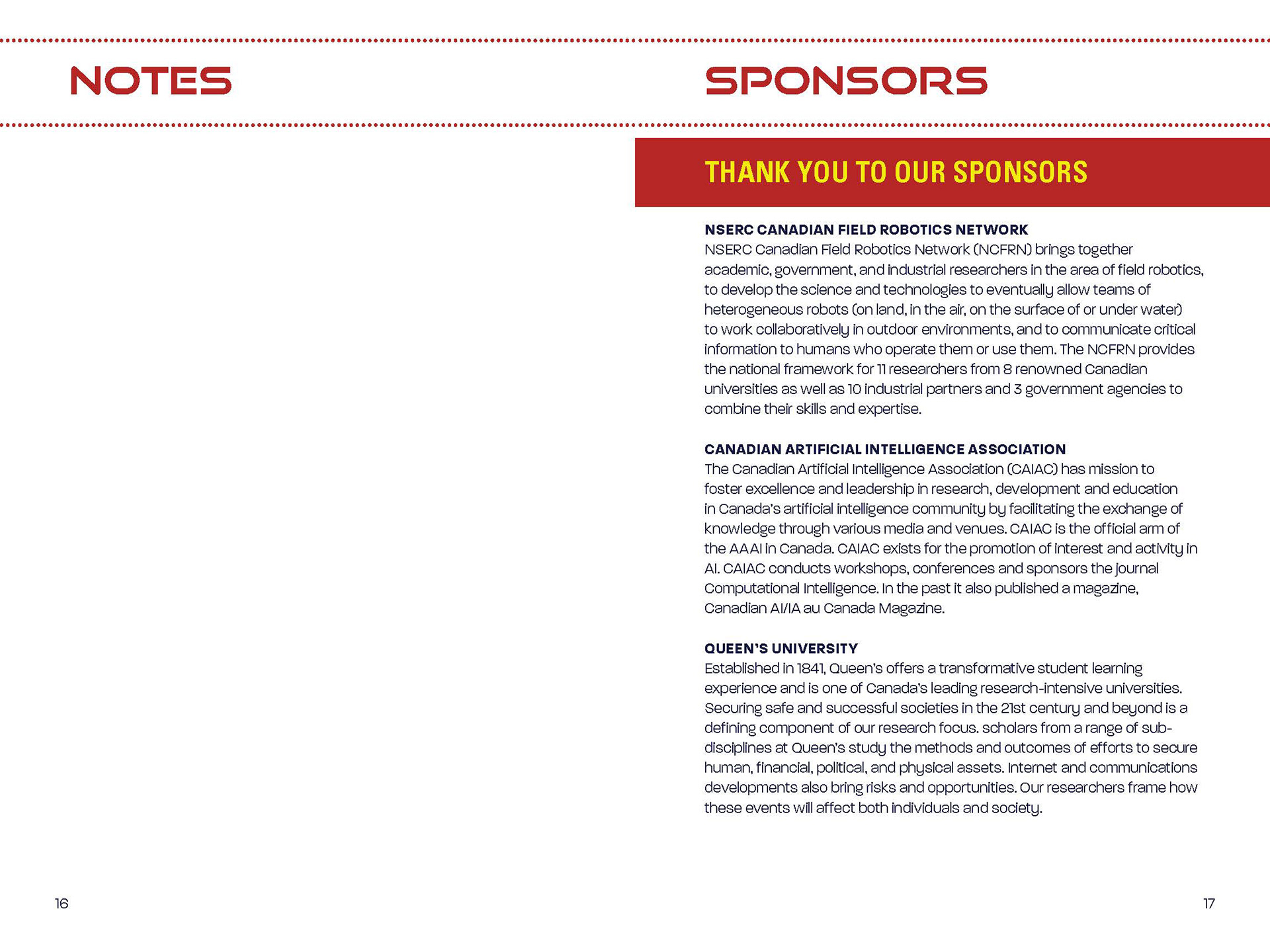
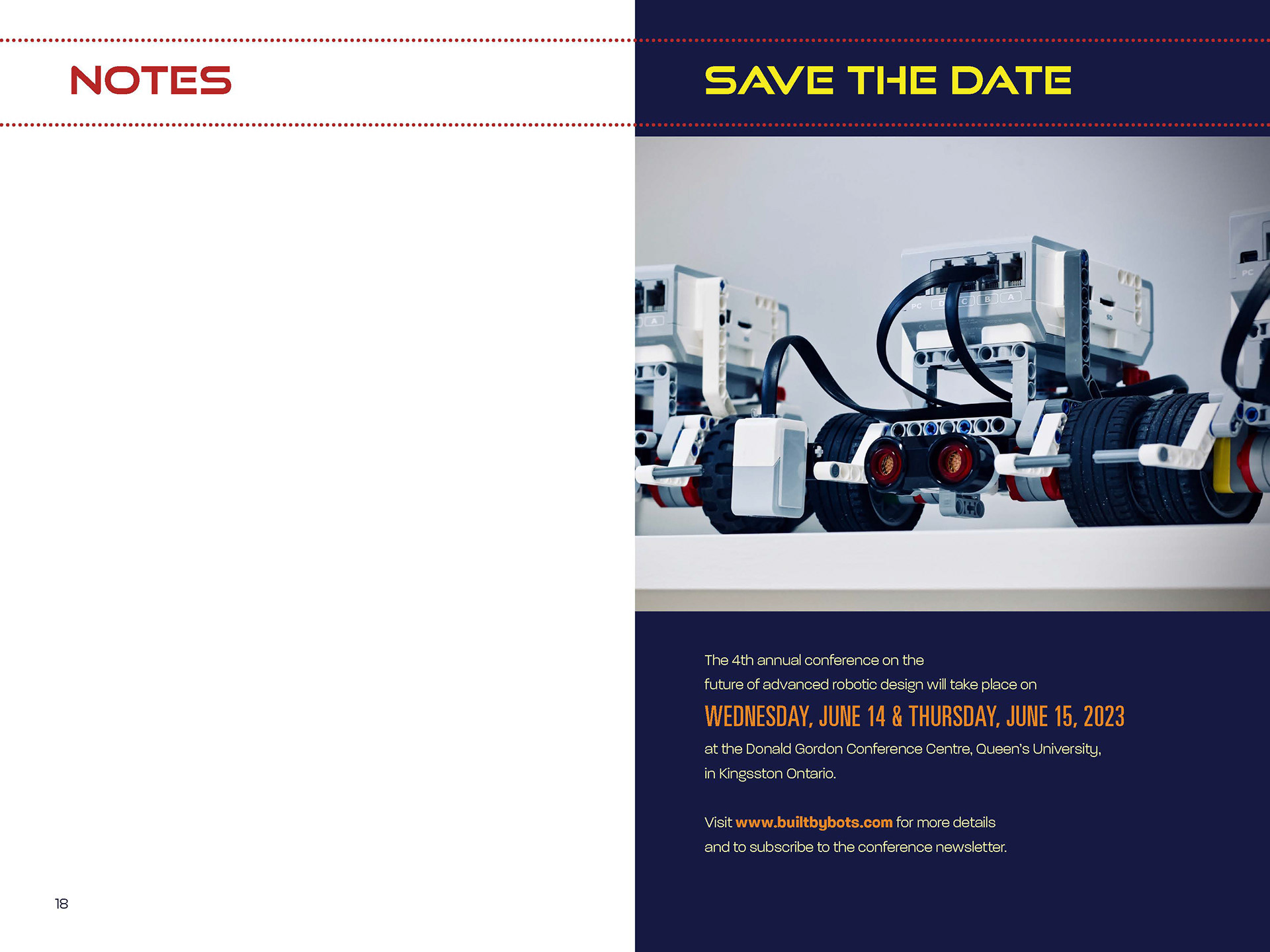
The images from above are my revised drafts for the Conference Booklet. I have applied the suggestions from last week's critique such as saving the blue background for some pages only, rethinking my colour choices, and so on.
From today's critique, it was noted that there's definitely a lot less contrast issue; the dashed dots are a nice touch to the headlines; the yellow looks great on the blue but it doesn't perform well on the white so well. To solve that issue, it was suggested that I use the orange hue (but it might be problematic against the red? I will have to play with it). Tweaking the value: 100% yellow, reduce the cyan, and bring up the magenta might also help. Using the blue on the gear illustration (on page 2) could also help make it pop.
Moreover, adding the illustration/graphic of the gear from the cover page all throughout the pages was also suggested. Light water mark treatment underneath some content somewhere or elements of it bleed somewhere.
For the notes, adding a rule such as dotted line (think bullet journal) was also recommended.
The cyan hue for the time schedule looks out of place so pulling from the commonly used colours in my palette might benefit the design. The orange was suggested for it.
Trying to look for opportunities to use the interesting graphic of the gear was recommended. So, instead of just the filled in yellow circle on my schedule pages, why not add elements of the gear instead?
All of these suggestions are great and helpful, which is why I'm always grateful to have critique sessions like this. I will try to incorporate all of these and see how it looks.