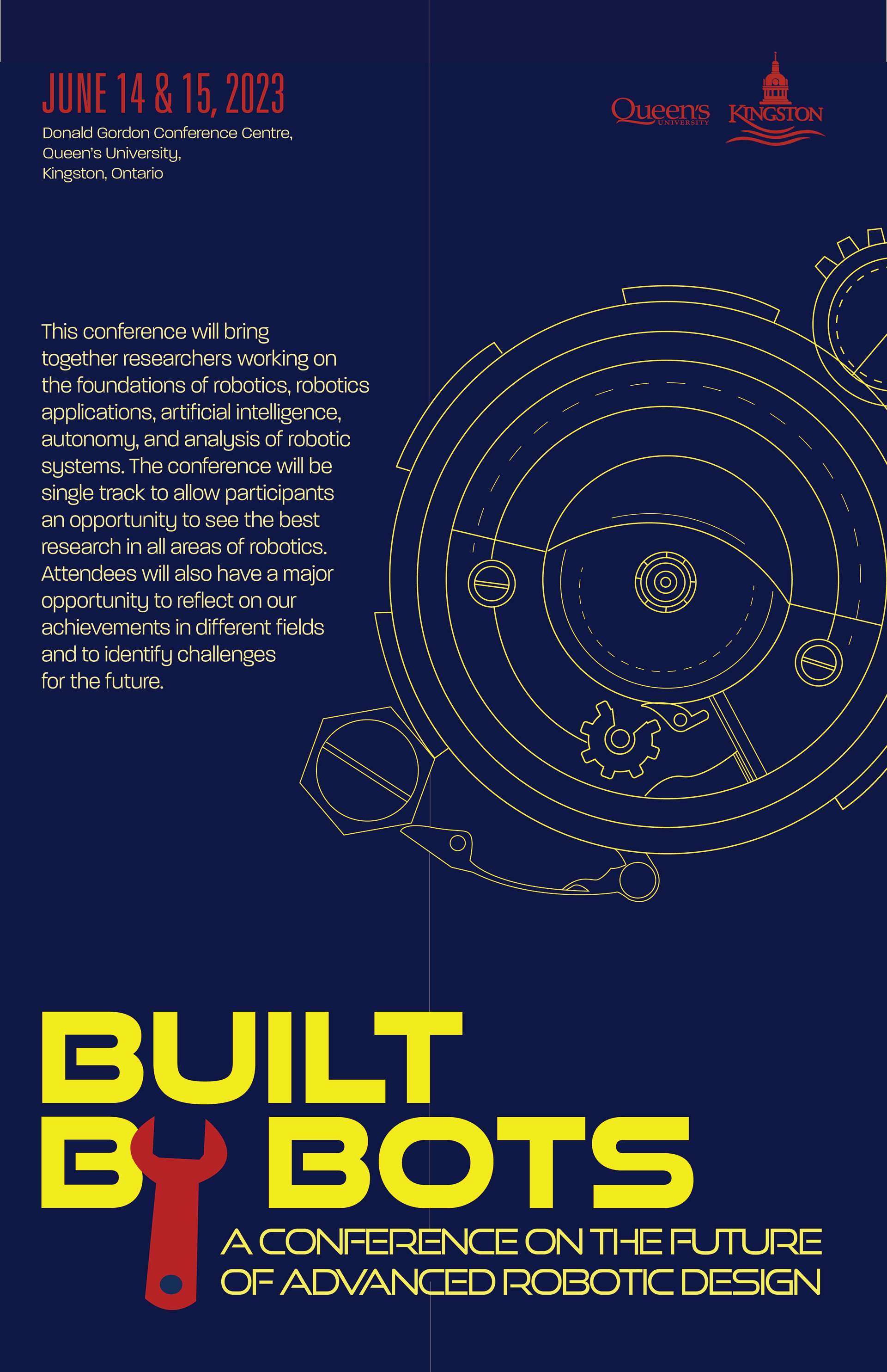

I applied all the suggestions I received from last week's critique. For the poster, I placed the headline conference below the title cluster as suggested. I have also eliminated the "th" in the dates. I added 1px for the body copy as well to make it a little bigger for better legibility. All the logos placed in the top right as well.
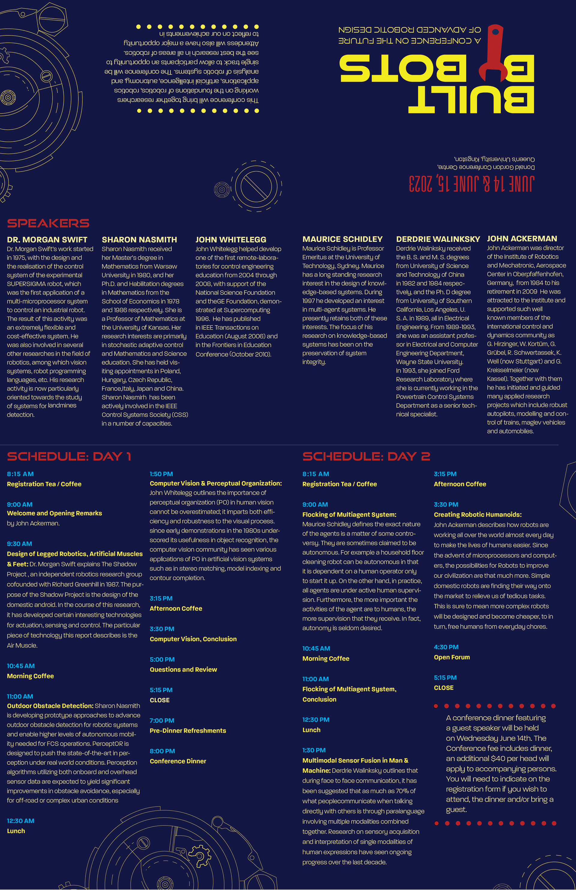
For the brochure, I also applied what was suggested previously. I increased the font size for the body copy to 9 pt., there is also no line break for the speakers so it looks more consistent and refined. Additionally, I have emphasized the Conference Dinner. I have also changed the colour of the times that has a better contrast against the background as also suggested.
This was really a fun project to make. I never thought I would enjoy documenting the process as much, but I did.