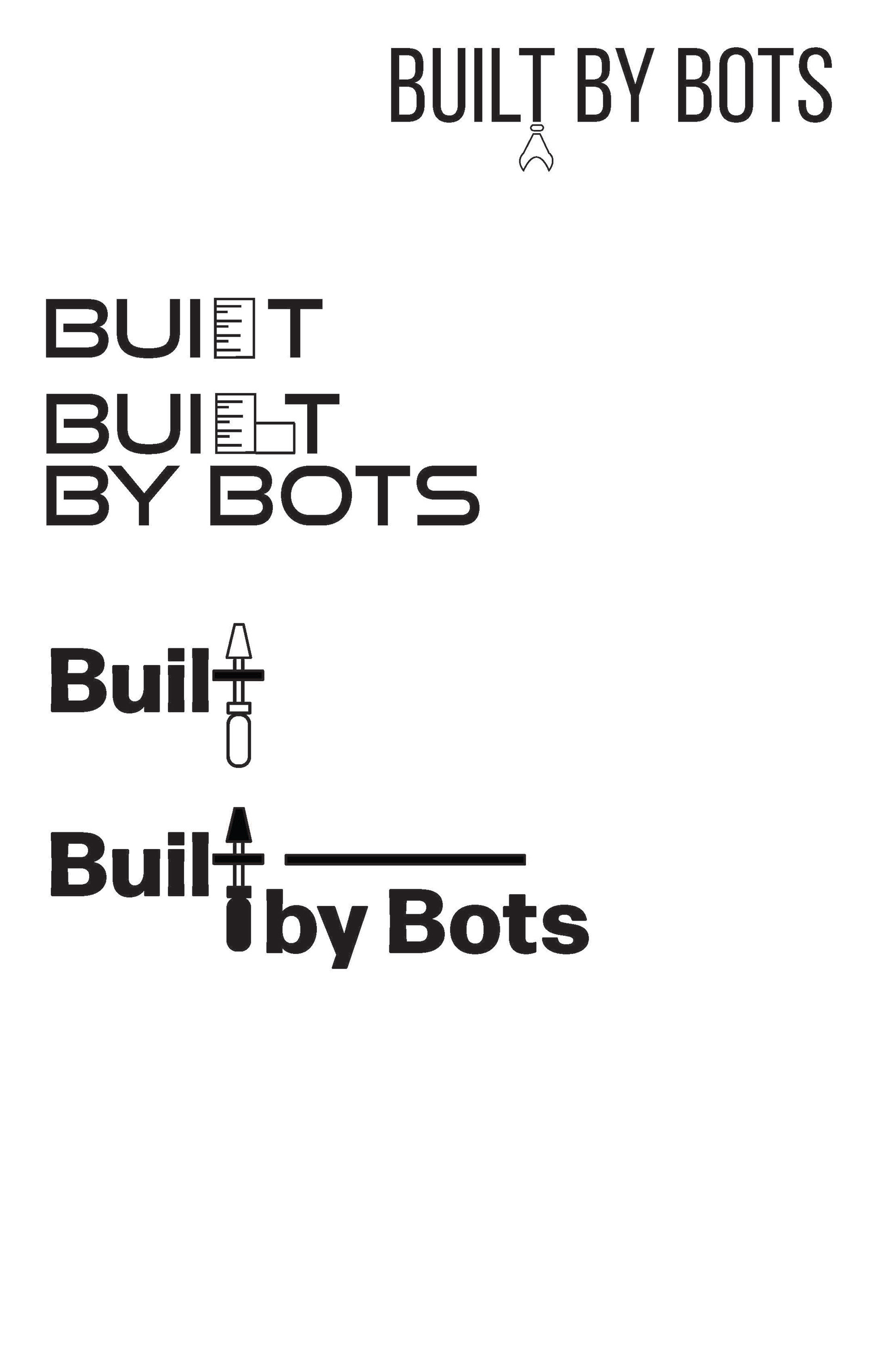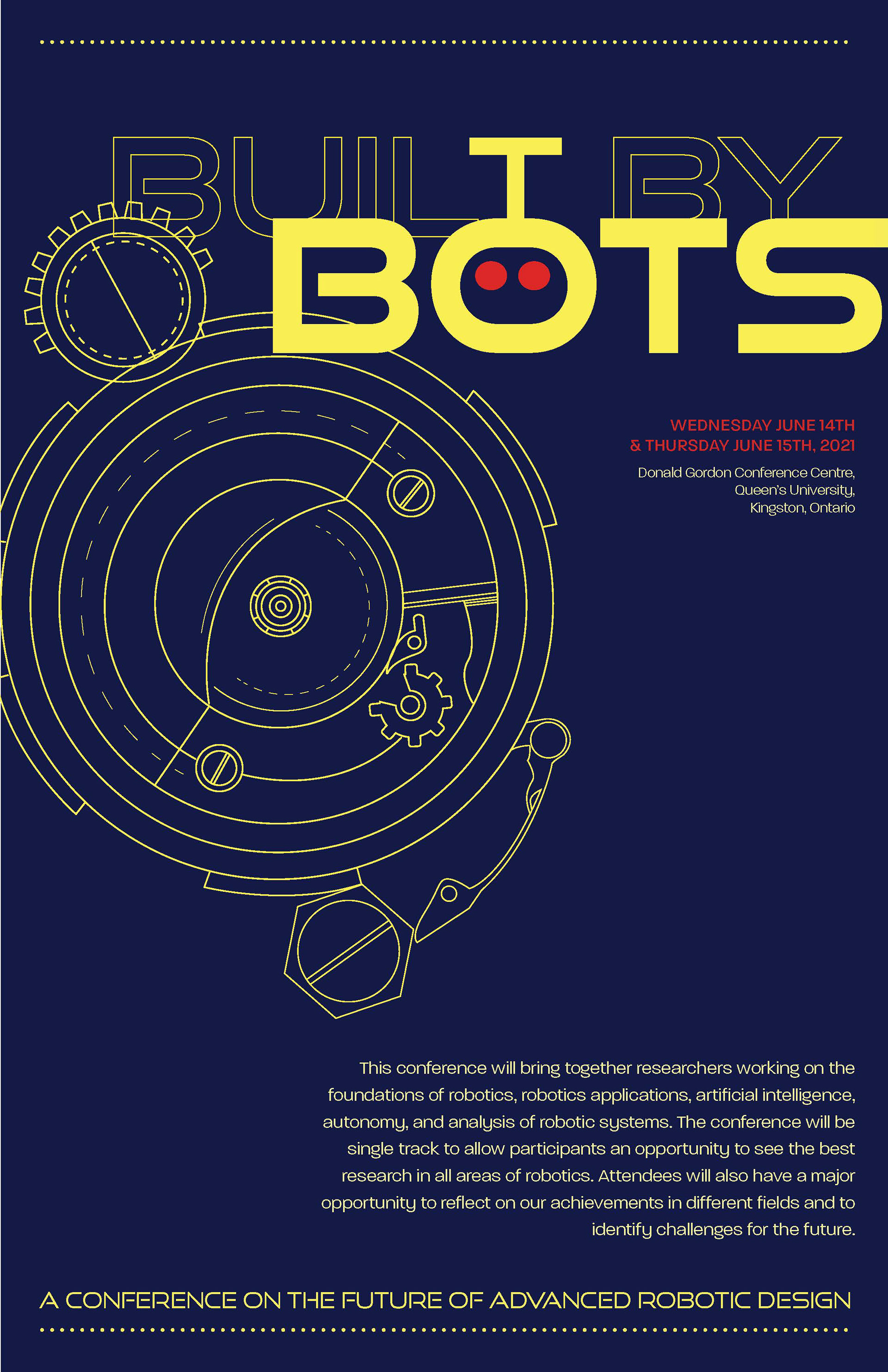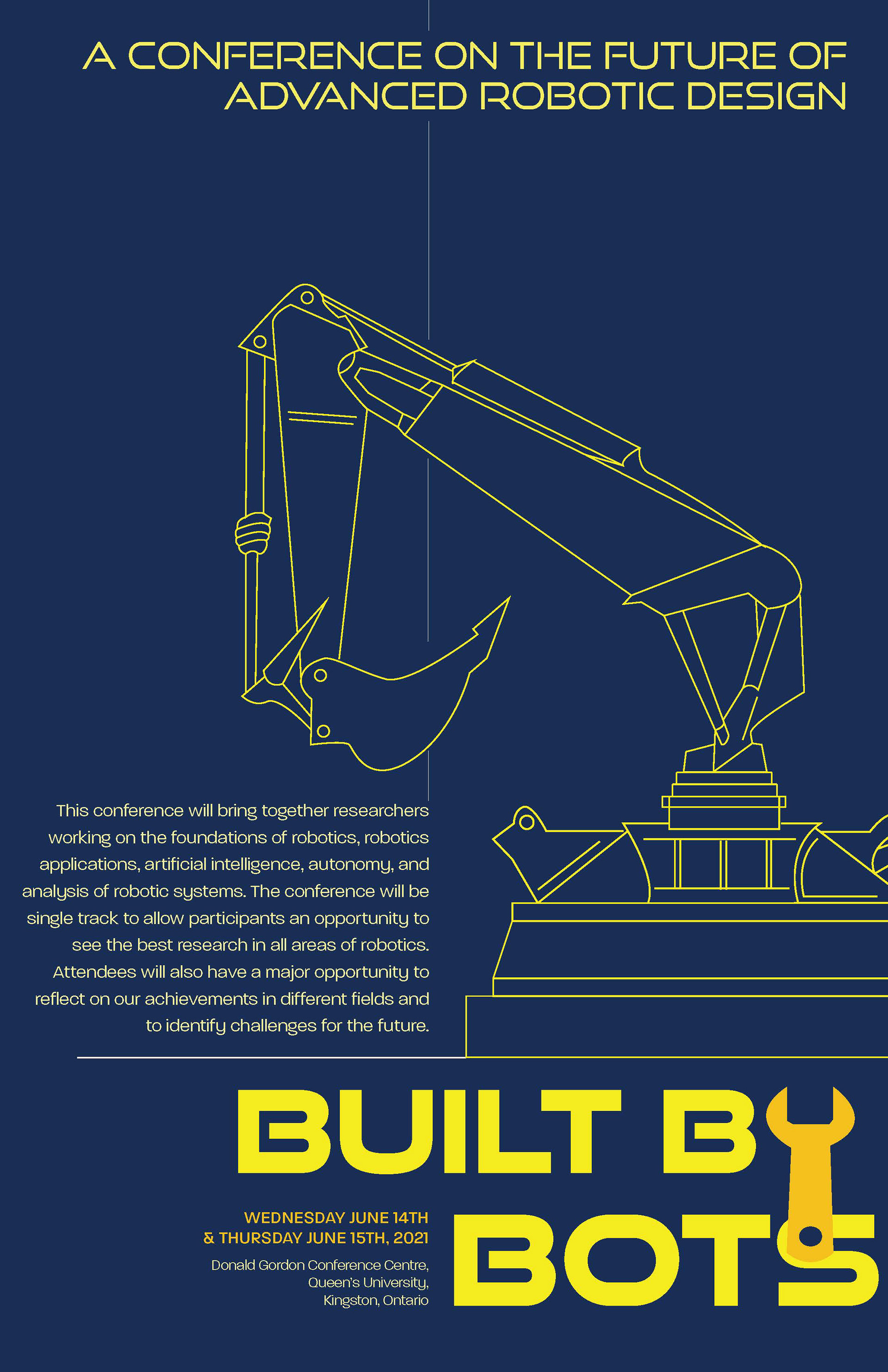


Due today was two different digital poster layouts including two refined title clusters, and one alternate digital cluster as well. The first image are my alternate digital clusters, and the following images are my two poster layouts.
The typefaces I used are Good Times (title & headings) and Paralucent (body copy).
The feedback I got today was the layout and grid I have on the second poster was working better than the first poster. However, the imagery on the first poster (gears) represents the title more than the second poster, which seemed to portray construction more.
The second title cluster received major votes, however, it was suggested that the wrench could use another colour. Right now, there is a contrast issue happening because the two colours are similar in value. Moreover, I was told that the alternate title clusters I had was good, however, the ones I already have on my two poster seem to be working great already with just a few tweaks here and there.