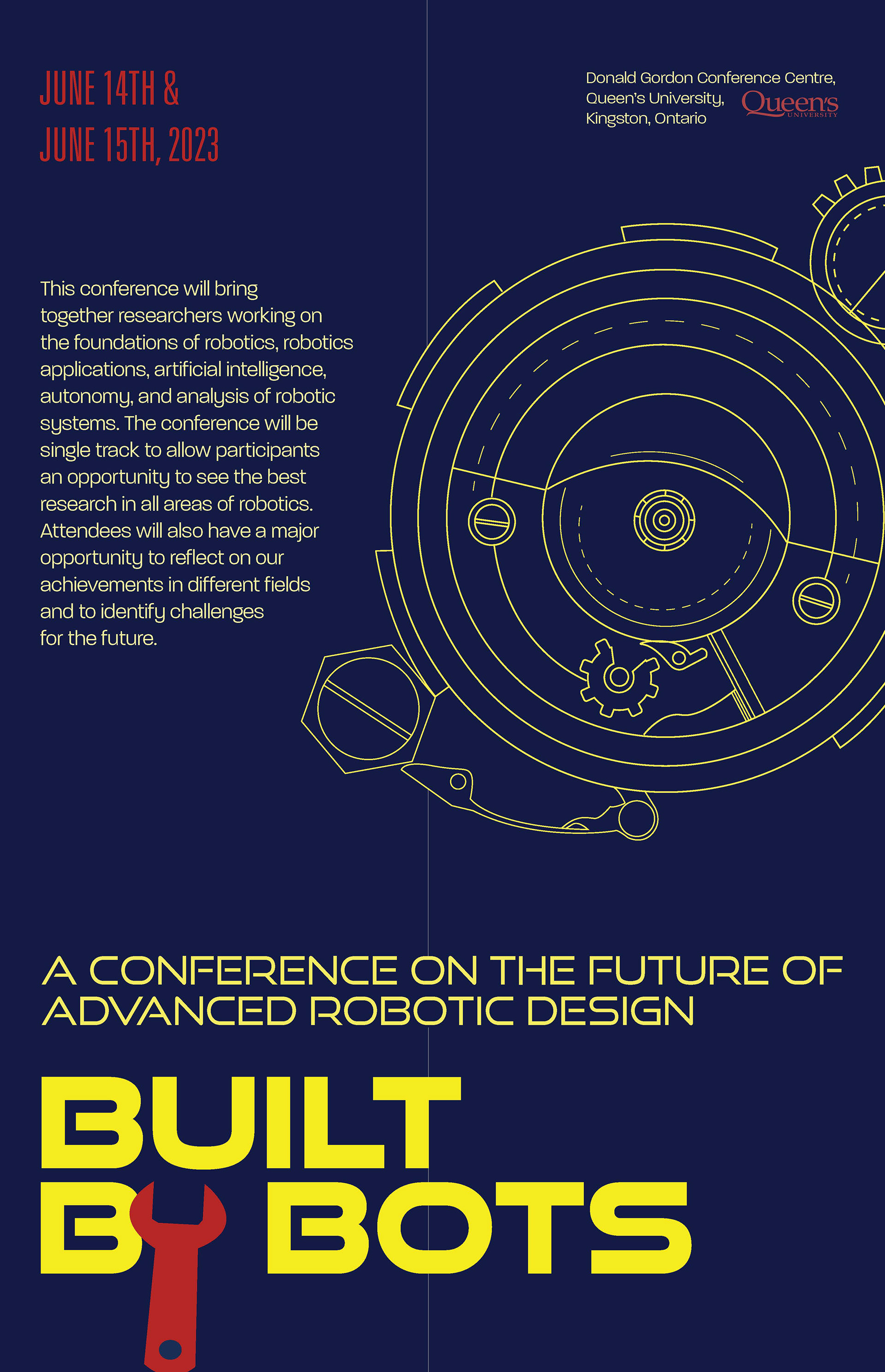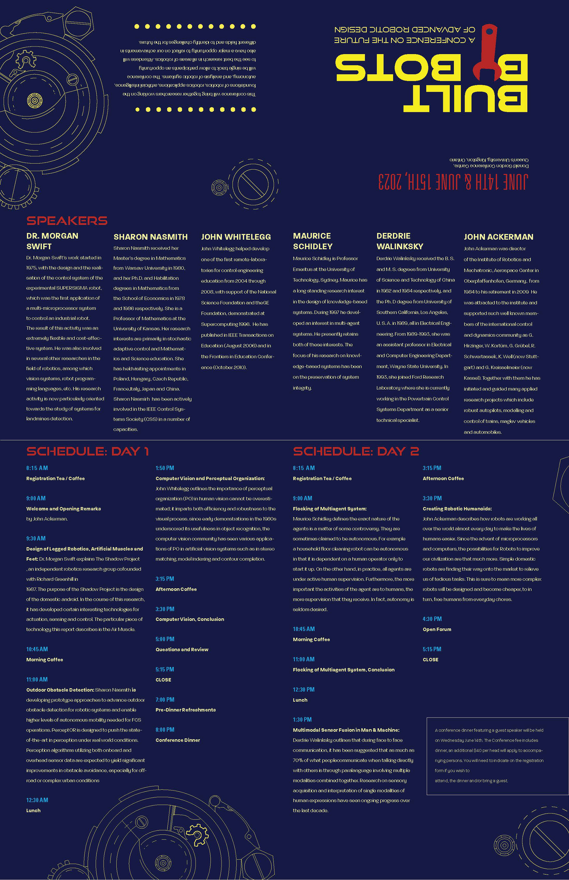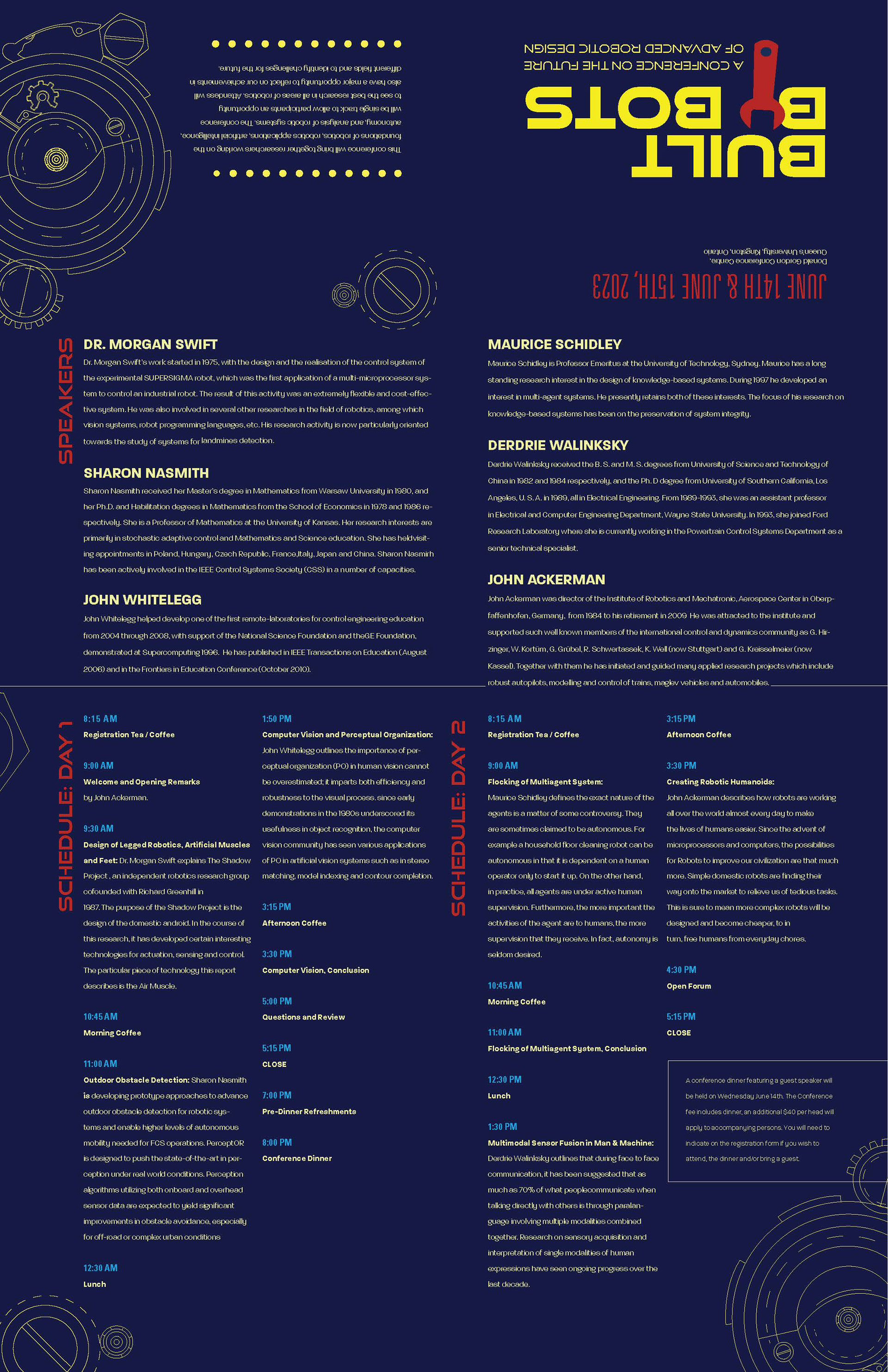


The first image is the latest refined version of my poster. The following images after that are my brochure layout proposals in digital form consisting of all the content.
The feedback I got from today's critique was:
For the poster, take out the redundant "June" on June 15th since it's there already on the June 14th. That way, it creates more space for a neat title cluster. Additionally, I could also take out the "th" at the end of the dates as well. The more space, the merrier.
For the poster, take out the redundant "June" on June 15th since it's there already on the June 14th. That way, it creates more space for a neat title cluster. Additionally, I could also take out the "th" at the end of the dates as well. The more space, the merrier.
Experimenting with the placement of the location might help as well. It could be under the date or the body copy. Another minor detail is that the City of Kingston logo is missing.
For the brochure layouts, the first eye-catching thing is the size of the font of the body copy. It is too small. I've had it at 7 pt. trying to get in all the details in there. Thankfully, I've received great suggestions from today's critique such as making it 8 pt. or 9 pt. even. The leading could be smaller (I had it at 15!) and it was suggested to be lower, minimum of 11. The Conference Dinner text is also getting lost in there; emphasizing it more would help. Another tip is that the margin doesn't need to be that big since it is for a brochure so I shouldn't be afraid to decrease its size.
It was also suggested that the title cluster I had going on the brochure is great, however, it's not incorporated in my poster. And so, these are what I will be working on.