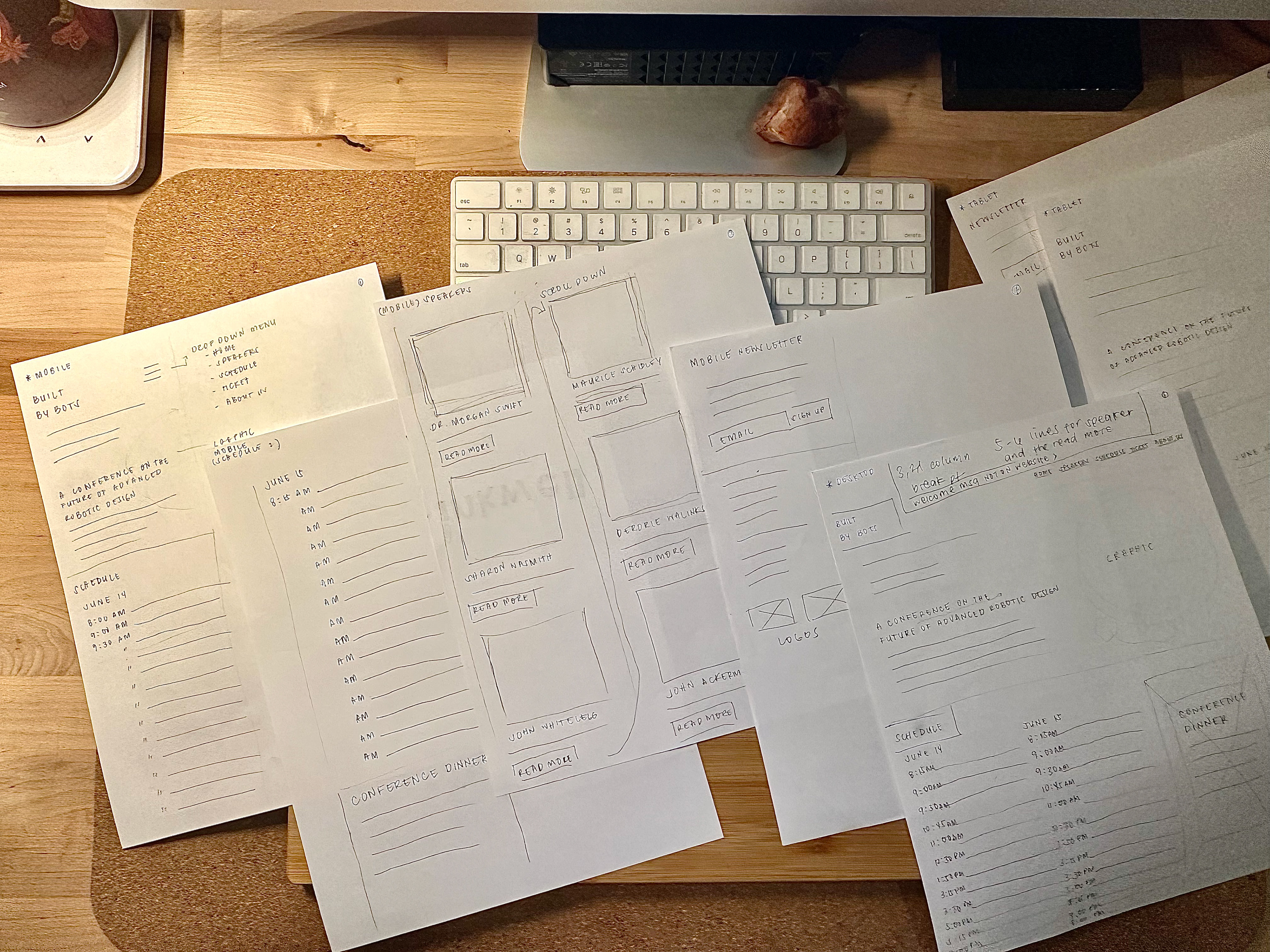
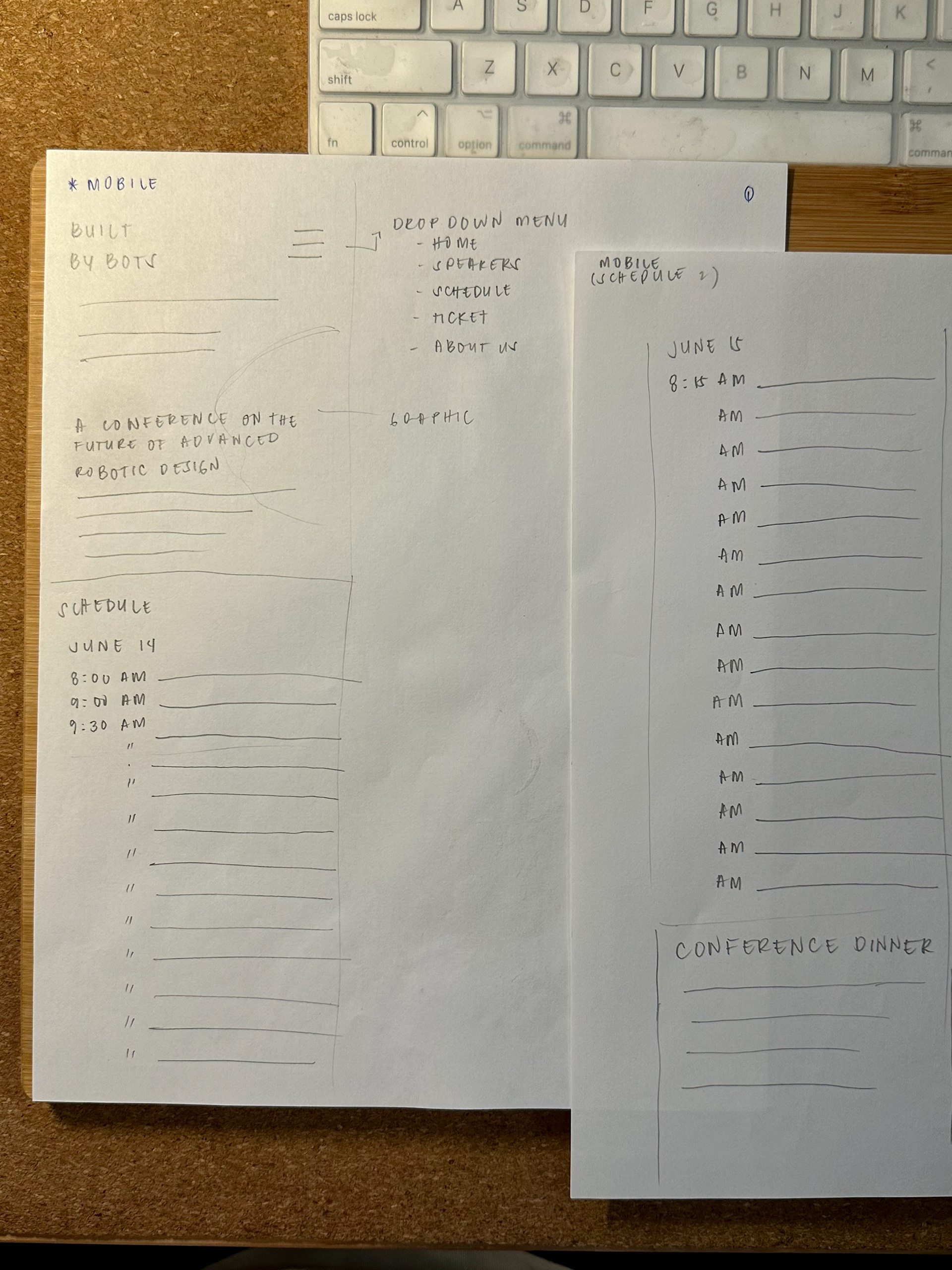
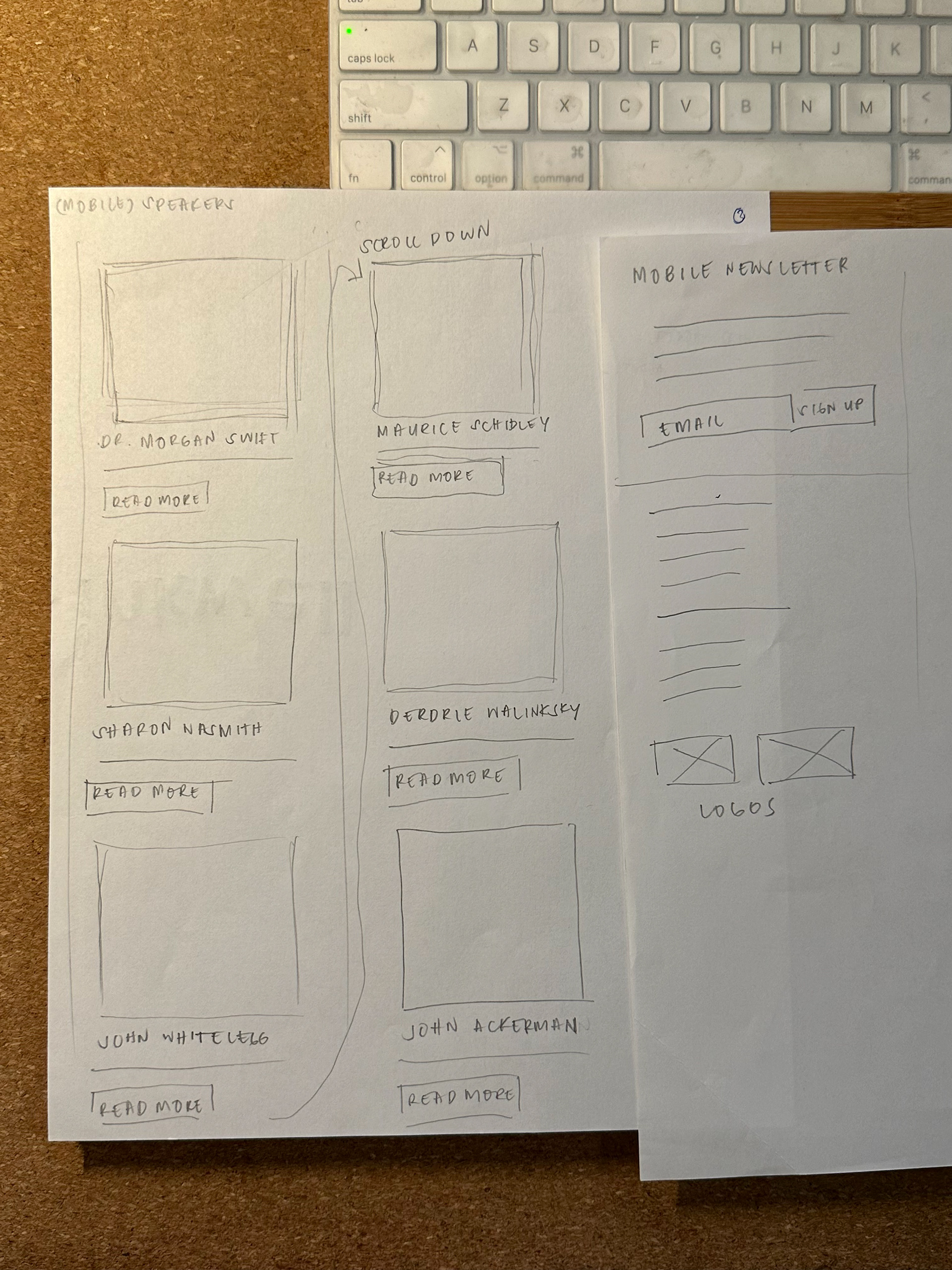
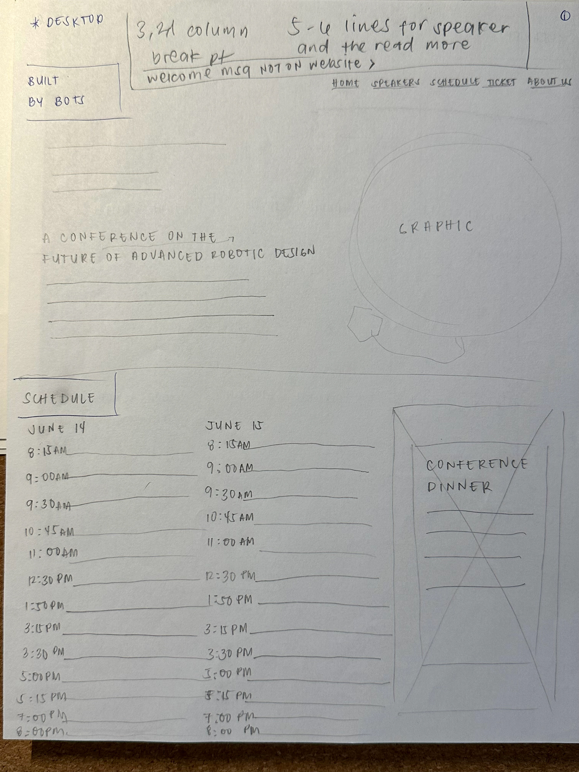
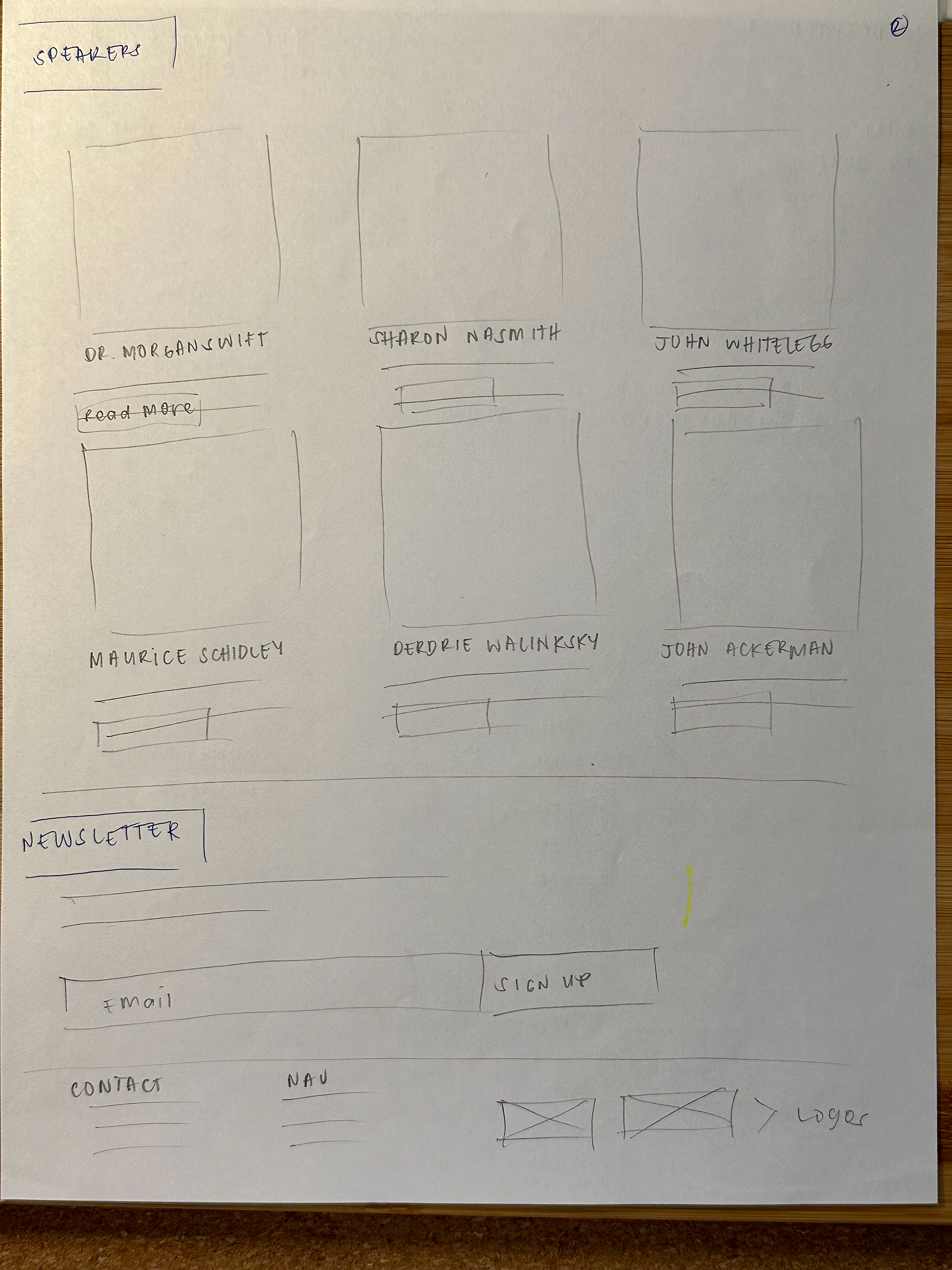
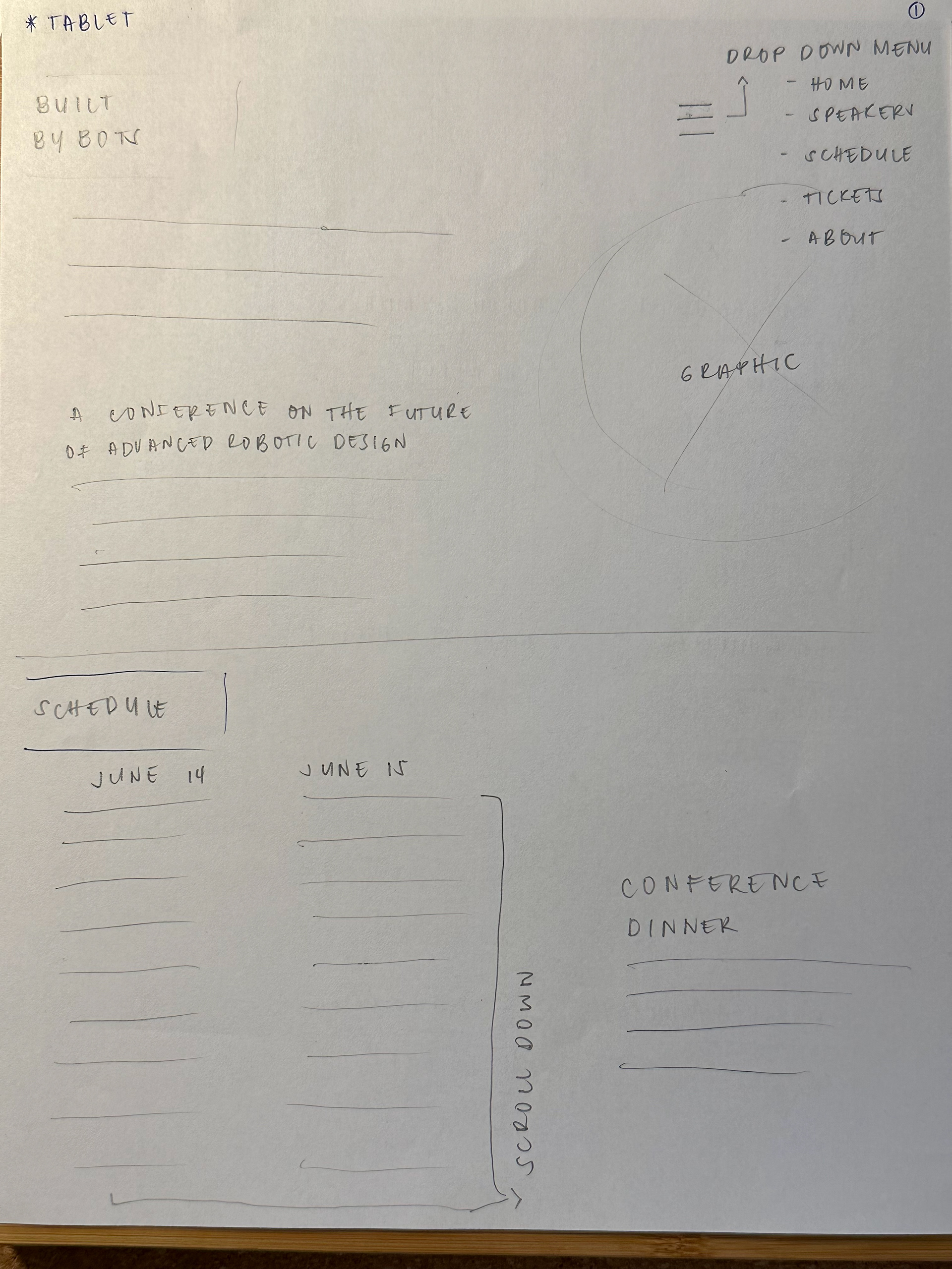
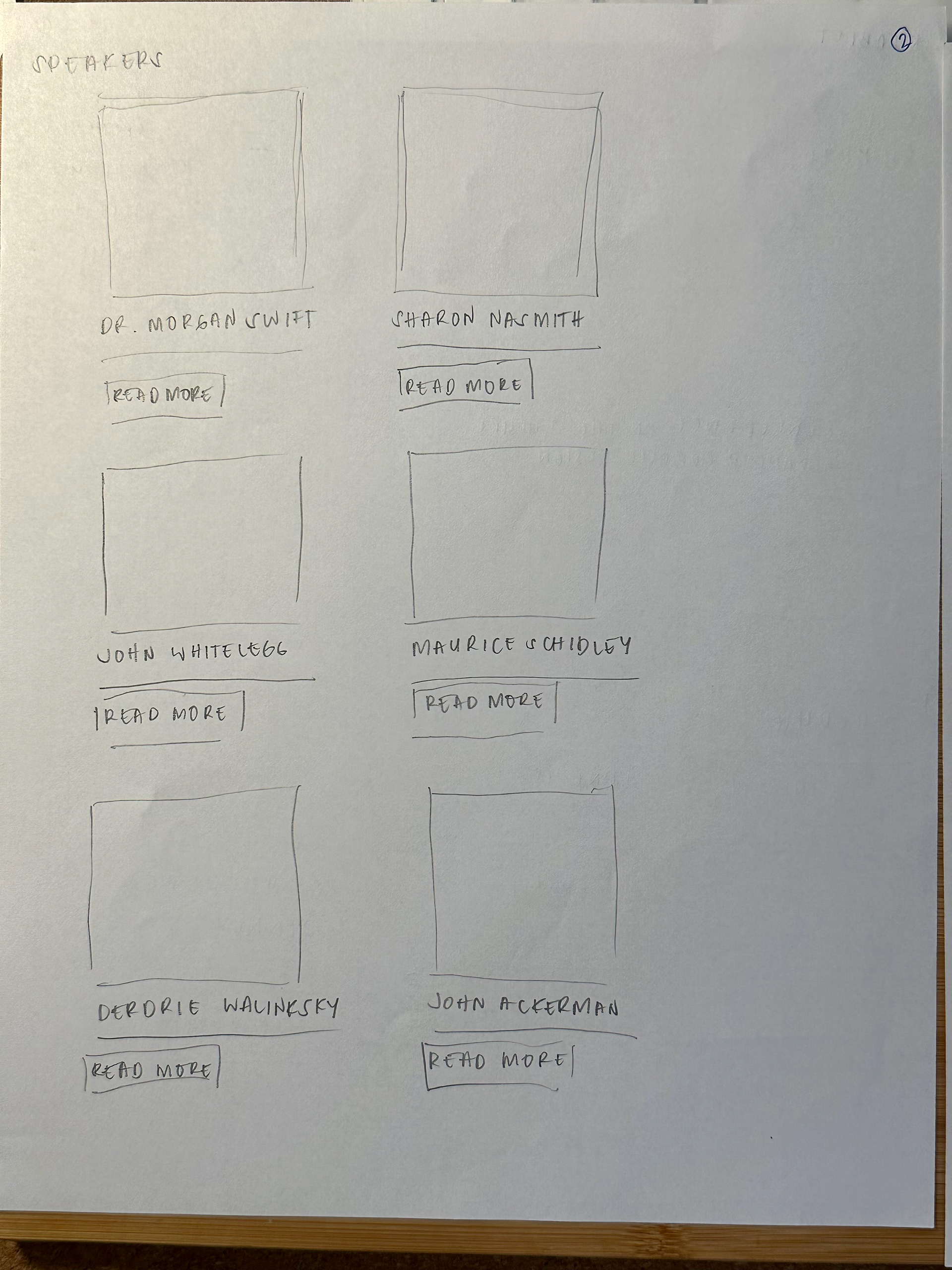
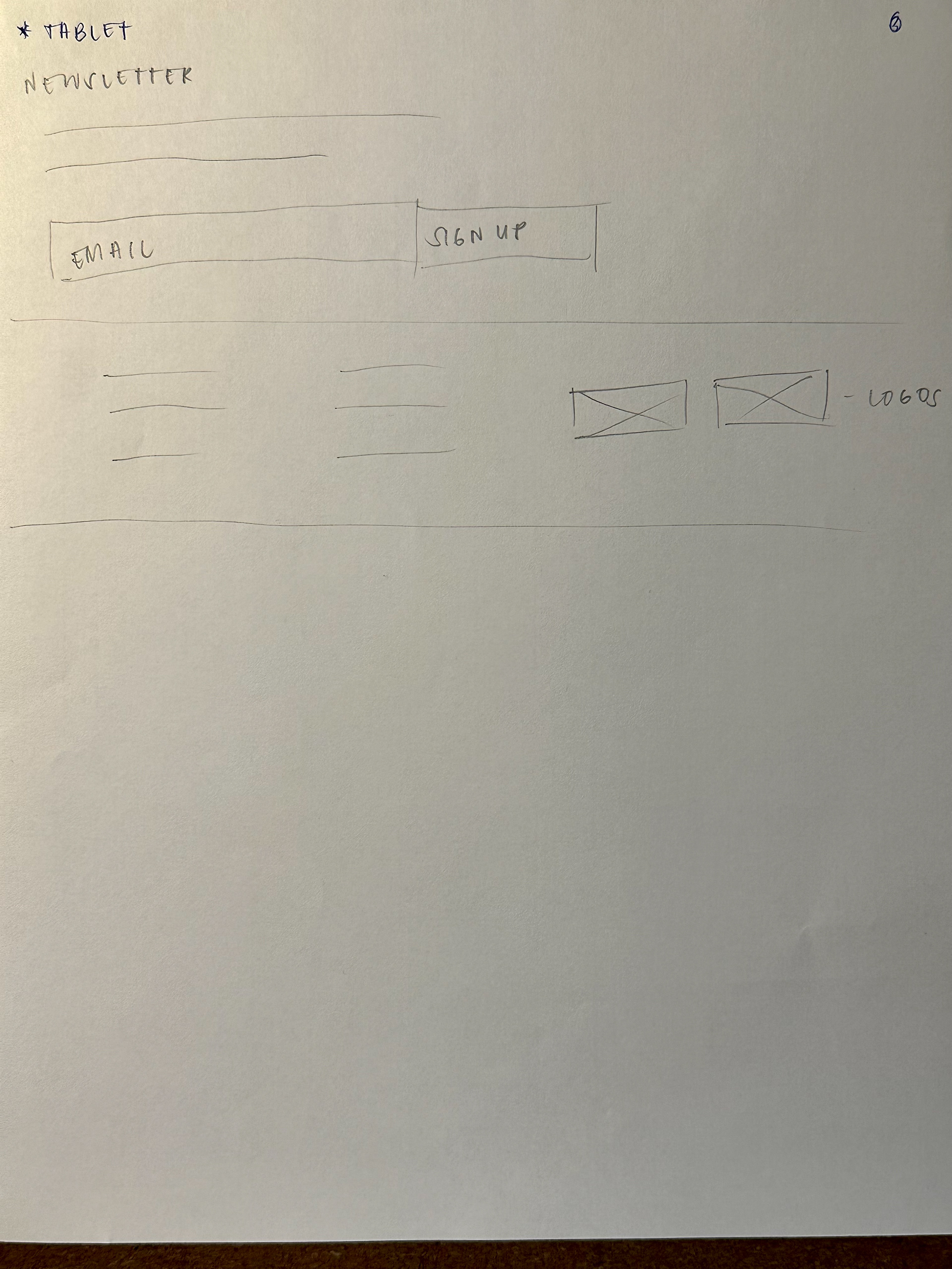
Shown in the pictures are my wireframe sketches for the Conference Home page based on three break points which are: desktop, tablet, and mobile.
The feedback I received from today's critique is that my desktop and mobile wireframe seems to be working, however, I might have to rethink going from a three-column policy to a two-column instead as I will have to work with a much smaller space than desktop. I might have to do three column for desktop, two column for tablet, and one column for mobile.